
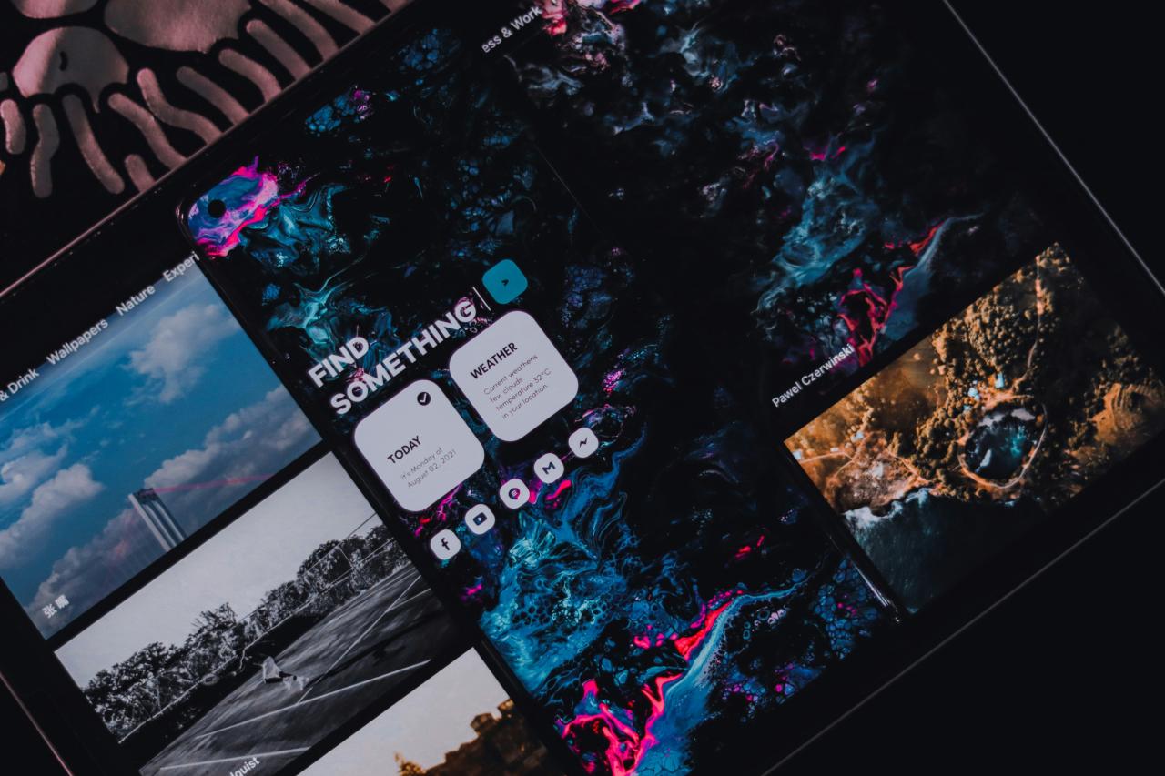
Optimizing dark-first architecture for web interfaces represents a fundamental shift in how digital products handle visual hierarchy, color theory, and user comfort.
For decades, software developers and website designers treated light backgrounds as the default canvas, treating dark themes as an afterthought or a simple cosmetic toggle.
However, forcing dark mode onto a layout originally built for bright backgrounds often results in muddy contrast ratios, illegible typography, and severe visual glare that frustrates site visitors.
Building a true dark-first digital product requires planning your color choices, shadow systems, and visual layers around dark surfaces right from the initial concept phase. This purposeful approach eliminates the harsh blue light and excessive screen brightness that cause heavy eye fatigue during late-night browsing sessions.
A well-executed dark interface saves battery power on modern OLED mobile screens, making your web application remarkably energy-efficient for users on the go.
By combining soft charcoal backgrounds, glowing accent highlights, legible typography, and subtle elevation layers, designers create sleek digital environments that users love to explore.
Embracing dark-first architecture allows digital creators to craft distinctive, highly accessible web applications that capture user focus while delivering exceptional visual comfort.
A. Select Soft Charcoal Background Shades To Prevent Heavy Eye Fatigue

Selecting soft charcoal or deep dark gray background tones forms the bedrock of a comfortable dark-first user interface design. Many inexperienced designers mistakenly use pure black backgrounds across their entire site, assuming it produces the sleekest modern dark aesthetic possible.
However, placing bright white body text directly over pure pitch-black surfaces creates extreme contrast, causing an unpleasant visual buzzing effect called halation.
Using deep charcoal tones softens this harsh contrast, making text content exceptionally smooth and easy to digest during long reading sessions. Establishing a gentle background foundation protects your visitors from severe eye strain while keeping your visual layout looking sophisticated.
Web users often complain about eye strain and blurry text when websites use pure white fonts directly on solid pitch-black backgrounds.
From my perspective, you can easily eliminate text buzzing by swapping solid black canvas colors with off-black charcoal shades. Pairing off-white typography with dark slate backgrounds creates a gentle reading environment that keeps visitors reading comfortably for hours.
This simple surface adjustment solves your legibility struggles completely, delivering a sleek aesthetic that feels completely natural to human eyes. It guarantees that long-form articles remain easy on the eyes, preserving user comfort across every device screen.
B. Implement Subtle Elevation Layers To Define Clear Visual Hierarchy
Implementing subtle elevation layers using lighter gray tones establishes a clear visual structure without relying on harsh physical borders. In traditional light designs, creators drop soft gray shadows beneath cards and pop-up boxes to separate them from the background canvas.
In dark-first layouts, dark shadows disappear against dark backgrounds, rendering traditional drop shadow systems practically invisible to site visitors.
Applying progressively lighter surface shades to elevated UI components creates an intuitive sense of depth that guides user attention naturally. This elevation system organizes your page elements cleanly, ensuring users instantly recognize floating menus, card containers, and interactive forms.
Product teams frequently struggle with flat, cluttered dark layouts because standard drop shadows become completely invisible on dark surfaces.
I observe that you can smoothly resolve flat UI confusion by assigning lighter charcoal shades to cards that sit higher in your layout stack. Elevating key interaction boxes with subtle surface brightness replaces invisible shadows and defines clean component boundaries effortlessly.
This elevation technique solves your layout hierarchy problems perfectly, making your web application feel organized and beautifully structured. It transforms flat, muddy screens into dynamic spatial interfaces that users can navigate without second-guessing their choices.
C. Desaturate Vibrant Accent Colors To Maintain High Visual Accessibility
Desaturating vibrant accent colors prevents intense glowing effects that blind users and destroy content readability on dark canvas surfaces. Bright primary colors designed for white backgrounds often bloom aggressively when placed over deep charcoal surfaces, hurting user focus.
Muting your accent palette by lowering saturation levels while slightly increasing brightness keeps interactive links and buttons clear without overwhelming the eye.
Reserving high-intensity neon colors exclusively for critical status alerts or active state indicators maintains a balanced visual hierarchy across your pages. Careful color tuning keeps your brand identity vibrant while preserving accessible, comfortable contrast ratios for all users.
Designers often notice that bright brand colors look overly aggressive and harsh when placed directly onto dark interface backgrounds.
The truth is that softening your brand accent shades by lowering their color saturation creates a pleasing glow that guides user eyes smoothly. Utilizing muted pastel accents for primary links ensures your call-to-action buttons stay visible without causing visual discomfort.
This color calibration strategy solves your brand presentation challenges beautifully, giving your website an elegant, polished tone that users enjoy. It delivers an ideal balance between brand energy and visual comfort, keeping your interface accessible for everyone.
D. Adjust Typography Weights To Preserve Sharp Legibility Across Screens
Adjusting typography weights and letter spacing ensures that body text remains sharp, clean, and effortless to read against dark backgrounds. Light text on dark surfaces inherently appears thicker to human vision than dark text printed on bright white paper.
Using ultra-bold font weights on dark canvas elements often causes letterforms to bleed together, obscuring small details and reducing reading speed.
Choosing slightly lighter font weights and adding generous tracking between characters prevents text clustering, making your copy look remarkably crisp. Refining your typographic details ensures your written message lands with maximum impact without exhausting your reader’s vision.
Readers frequently encounter blurry, crowded text when web designers use heavy font weights on dark-themed blog pages and web apps.
I believe that dropping your body text weight down one notch and increasing letter spacing slightly restores perfect typographic clarity instantly. Giving your words extra breathing room prevents light bleed, ensuring every character stays distinct and easy to scan.
This typographic refinement solves your text legibility issues completely, creating a smooth reading flow through your written content. It provides a solid structural base that makes complex information look inviting, organized, and effortlessly stylish.
E. Optimize Media Assets To Blend Seamlessly Into Dark Environments
Optimizing media assets like illustrations, product photos, and icons ensures they integrate smoothly into dark backgrounds without creating jarring white box borders. Many websites suffer from ugly visual breaks when transparent PNG images contain bright white edge artifacts or light background cutouts.
Applying subtle dark overlays or custom border treatments around embedded imagery softens sharp frame edges, making media feel like an organic part of the page.
Utilizing vector graphics with adaptable fill colors allows your icons to shift shades automatically depending on surface elevation. Blending your visual media seamlessly maintains layout harmony, keeping users immersed in your sleek dark environment.
Website owners frequently feel frustrated when rectangular white image backgrounds ruin the clean aesthetic of their dark mode pages.
You can easily prevent visual layout breaks by using transparent SVG graphics and applying subtle dark gradient overlays over uploaded photos. Blending image boundaries into surrounding charcoal cards ensures your media looks intentionally tailored for dark environments.
This media optimization workflow solves your asset integration hurdles completely, maintaining a premium look across your entire website. It delivers a unified digital experience that keeps your content looking continuous, professional, and visually captivating.
Conclusion
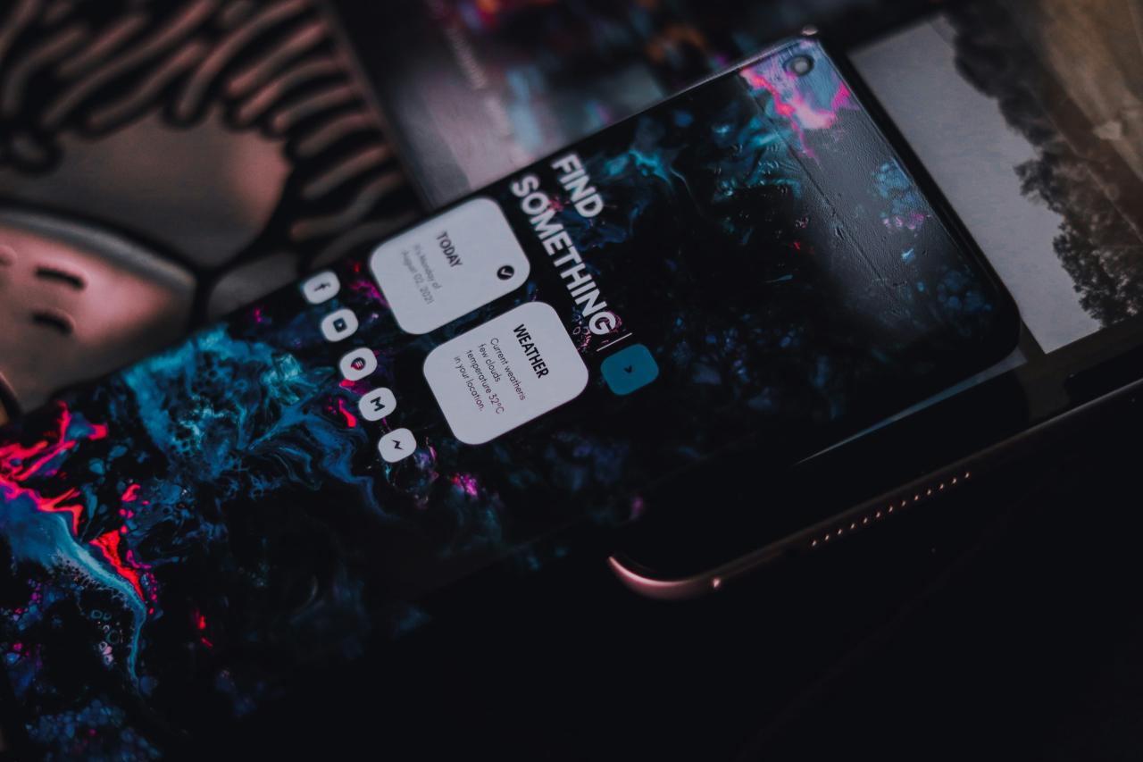
Optimizing dark-first architecture provides the ultimate strategy for crafting modern, highly comfortable web interfaces today. This thoughtful design framework removes visual fatigue by replacing glaring white canvases with soft, energy-efficient charcoal surfaces.
You can build an exceptionally sleek and accessible website with complete confidence by implementing these fundamental dark UI techniques. Selecting soft charcoal shades eliminates harsh contrast buzzing, keeping your written content smooth and easy on human eyes.
Subtle surface elevation layers replace invisible drop shadows, defining clear visual boundaries for every card and floating menu. Trust these tailored gray surfaces to organize your page hierarchy while giving your web application a refined aesthetic.
Desaturating vibrant accent colors ensures that interactive buttons guide user attention without blinding visitors with intense light blooms. Adjusting font weights and letter spacing prevents text bleed, ensuring your body copy stays remarkably sharp across all displays.
Optimizing your media assets guarantees that images blend seamlessly into your layout without creating ugly white border cuts. Executing these dark-first design principles transforms your digital product, delivering a smooth user experience that keeps visitors engaged.