
Eliminating friction in modern user journeys serves as the ultimate strategy for turning casual website visitors into loyal brand advocates today. Many online business owners mistakenly focus entirely on driving broad traffic without realizing that complex navigation forms and slow page speeds quietly ruin their conversion rates.
When potential customers encounter unexpected visual distractions, confusing button layouts, or endless form fields, they quickly abandon their shopping carts out of sheer frustration.
Modern web users demand instant page loads, effortless checkout paths, and completely transparent interactive elements across every single digital touchpoint. Frictionless user experience design solves these common digital bottlenecks by removing unnecessary steps, simplifying data inputs, and clarifying primary navigation choices.
By focusing on intuitive user interface flows, dynamic visual feedback, and responsive layout structures, digital creators make online interactions feel remarkably smooth.
Creating a seamless user journey reassures online buyers that your website values their precious time, building immediate brand trust throughout their browsing experience. Forward-thinking product designers and digital strategists actively streamline their web interfaces to ensure every click moves visitors closer to their goal.
Transforming your digital ecosystem into an effortless, friction-free environment sets your brand apart early in your customer relationship. It establishes an incredibly responsive web architecture that works continuously to simplify user decisions, reduce drop-off rates, and elevate overall customer satisfaction.
A. Streamline Website Navigation Layouts To Guide Visitors Effortlessly
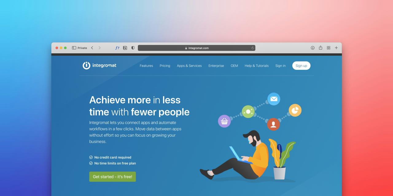
Streamlining website navigation layouts ensures visitors find essential product information without clicking through endless nested menu categories. Overloaded header menus packed with dozens of drop-down links overwhelm new users, making simple browsing tasks feel frustrating and tedious.
Organizing menu structures into clear, logical categories helps users locate desired landing pages within a few fast clicks.
Using descriptive menu labels removes guesswork, allowing users to predict exactly where a link leads before selecting it. Keeping your top navigation bar clean and clutter-free creates a clear visual pathway that guides users smoothly through your website.
Web visitors often feel overwhelmed and leave websites quickly when cluttered header menus offer too many competing link options.
From my perspective, you can easily solve menu confusion by consolidating minor pages into a simple footer menu while keeping your main header focused on core categories. Grouping related products under four or five clear primary tabs gives visitors an effortless navigation path straight to your top offerings.
This structural layout cleanup solves your bounce rate issues completely, delivering a crisp browsing experience that keeps users exploring your site happily. It guarantees that every visitor finds key information instantly without getting lost in a maze of unnecessary options.
B. Minimize Form Field Requirements To Accelerate User Conversions
Minimizing required form fields removes massive friction during registration, lead generation, and checkout processes across all device screens. Requesting excessive personal details, such as phone numbers or birth dates, creates privacy hesitation and slows down form completions.
Limiting form inputs exclusively to essential data, like email addresses and payment details, speeds up checkout times significantly. Incorporating smart auto-fill technology and real-time input validation helps users complete forms accurately without experiencing post-submission error resets.
Simplifying your input requirements demonstrates respect for user time, encouraging more visitors to complete their desired actions.
Online shoppers frequently abandon lead forms and shopping carts midway when forced to fill out long, unnecessary personal information fields.
I observe that you can smoothly resolve form drop-offs by removing all optional fields and enabling browser auto-fill integrations across your site. Allowing users to complete checkout forms in just three quick clicks removes mental fatigue and boosts completed transactions immediately.
This data input optimization solves your conversion bottlenecks perfectly, turning tedious typing tasks into a swift, satisfying interaction for every customer. It provides a frictionless registration flow that invites new users into your digital platform without forcing them through tedious data entry hurdles.
C. Optimize Page Loading Speeds To Prevent Immediate User Drop-Offs
Optimizing page loading speeds prevents visitors from abandoning your site before your main visual content even renders on screen. Slow-loading images, heavy custom scripts, and uncompressed video backgrounds frustrate mobile users on variable cellular data networks.
Compressing media files, utilizing lazy loading techniques, and streamlining site code ensure your pages display in under two seconds flat. Fast-loading web pages capture user attention instantly, keeping visitors engaged with your message instead of staring at blank screens.
Prioritizing technical speed optimization builds a solid operational foundation that keeps your user journey fast, responsive, and completely seamless.
Mobile users routinely hit the back button and visit competitors when a website takes more than three seconds to display its content.
The truth is that converting heavy image files into modern WebP formats and delaying non-essential background scripts drops page load times dramatically. Delivering near-instant screen rendering saves your mobile visitors from annoying buffering delays, keeping their focus fixed on your products.
This technical speed enhancement solves your bounce rate worries beautifully, creating an ultra-fast digital environment that delights users across all connection types. It delivers an essential speed boost that ensures your web content loads smoothly whenever and wherever users tune in.
D. Clarify Call-To-Action Messaging To Eliminate User Hesitation
Clarifying primary call-to-action button text eliminates confusion regarding what happens next after a user clicks a link. Vague button labels like “Submit” or “Process” leave users uncertain, causing hesitation right before critical transaction steps.
Using actionable, descriptive phrasing like “Get My Free Guide” or “Complete My Order” sets clear expectations for the user. Pairing clear action text with high-contrast button colors ensures primary choices stand out distinctly against background card elements.
Direct, transparent button messaging removes mental friction, encouraging users to take confident action across every landing page.
Readers often hesitate or stop entirely when call-to-action buttons use generic phrases that fail to explain the next step clearly.
I believe that swapping ambiguous button text with clear, value-focused action phrases removes user doubt instantly at key conversion moments. Telling users exactly what reward or page awaits them upon clicking builds trust and guides their decision-making process naturally.
This copywriting adjustment solves your click-through stagnation completely, transforming passive scrollers into confident, active participants across your website. It establishes a transparent user experience that removes hesitation and keeps your conversion funnel moving forward effortlessly.
E. Ensure Seamless Mobile Responsiveness For On-The-Go Browsing Comfort
Ensuring seamless mobile responsiveness guarantees that smartphone users enjoy the exact same frictionless experience as desktop visitors. Unoptimized mobile layouts feature tiny clickable buttons, horizontal scrolling issues, and text boxes that overlap awkwardly on smaller touchscreens.
Designing mobile-first interfaces with thumb-friendly button sizes and flexible grid structures makes browsing effortless on any device screen.
Enabling smooth touch gestures, such as swipeable product cards, matches natural mobile usage habits perfectly. Optimizing your website for mobile browsing comfort opens up your brand to millions of users who shop on the go.
Smartphone users quickly leave online stores when tiny links make clicking difficult or when text scales awkwardly off screen.
You can easily fix mobile layout friction by enlarging interactive touch targets to at least forty-eight pixels and using flexible single-column layouts. Spacing out clickable links and adopting fluid touch controls keeps mobile navigation comfortable, preventing frustrating misclicks during casual browsing sessions.
This responsive design upgrade solves your mobile engagement hurdles completely, giving smartphone users an intuitive, highly polished shopping space. It provides a flawless mobile environment that keeps customers browsing longer and completing purchases with total ease.
Conclusion
Eliminating friction in modern user journeys provides the ultimate foundation for building a highly successful digital presence today. This proactive user experience approach removes digital obstacles by replacing complex layouts with fast, effortless interaction paths.
You can build an exceptionally intuitive and high-converting website with complete confidence by implementing these friction-free design upgrades. Streamlining website navigation layouts eliminates confusing menu choices, ensuring visitors find key product information within seconds across all pages.
Continuous visual clarity guarantees that users explore your digital catalog effortlessly, keeping overall engagement levels exceptionally high always. Trust these simplified menu structures to guide customer focus smoothly toward your primary offers every single day.
Minimizing required form fields unlocks immediate speed for shoppers by turning tedious data entry into quick, simple micro-steps. Optimizing page load speeds and clarifying button messaging eliminate user hesitation, keeping your checkout funnel moving forward smoothly.
Ensuring seamless mobile responsiveness guarantees that touchscreen users enjoy an effortless browsing experience wherever they go. Executing these friction-reduction strategies transforms your digital product, creating a enjoyable user journey that drives higher customer satisfaction consistently.