
Integrating next-gen micro-interactions into your modern digital product serves as a powerful method for driving higher conversions today. Many website owners mistakenly believe that flashy banners or aggressive pop-up forms are the best tools for catching customer attention.
However, relying on disruptive visual pop-ups often annoys site visitors, causing high bounce rates and ruining overall user experience. Subtle digital micro-interactions solve this user friction by providing immediate, delightful visual feedback whenever a visitor performs an action.
These functional design details include animated button hover states, dynamic loading indicators, interactive add-to-cart confirmations, and progress bars. By embedding responsive micro-animations into key user touchpoints, you guide potential buyers effortlessly through your sales funnel without feeling pushy.
Small visual rewards reassure users that your website processes their inputs accurately, reducing hesitation during critical transaction steps. Forward-thinking product designers and online business owners actively leverage micro-interactions to create intuitive, enjoyable online shopping journeys.
Enhancing your website interface with these dynamic micro-elements transforms static web pages into engaging digital experiences early in your user journey. It establishes a highly responsive design ecosystem that works continuously to clarify user choices, increase trust, and boost sales conversions.
A. Implement Dynamic Hover Animations To Encourage Immediate Click Actions
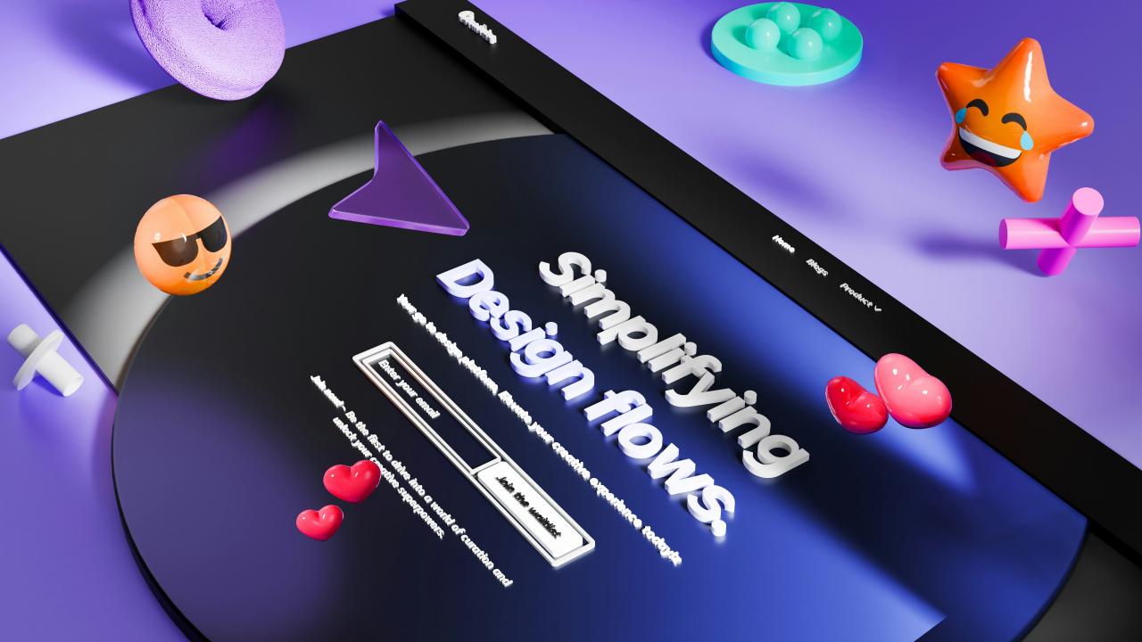
Implementing dynamic hover animations on primary call-to-action buttons gives users immediate visual confirmation that an element responds to input. Static buttons often feel lifeless, leaving visitors uncertain whether a link is clickable or active on mobile and desktop screens.
Subtle color shifts, slight elevation lifts, or smooth icon movements draw the user’s eye directly to your key conversion goals.
These subtle visual cues invite users to interact, turning passive browsing into active clicking with minimal effort. Designing intuitive hover effects clarifies interactive paths, making your web navigation feel remarkably fast and effortless.
From my perspective, you can easily eliminate user hesitation by adding soft elevation shifts and color transitions to your checkout buttons. Giving users instant visual feedback when their cursor touches a button removes confusion and builds immediate confidence in your website.
This simple design enhancement solves your click-through struggles completely, delivering an inviting interactive experience that guides users straight toward conversion. It ensures that every primary action stands out distinctly, keeping your user journey active and engaging.
B. Utilize Animated Cart Confirmations To Reassure Online Shoppers
Utilizing animated cart confirmations provides online shoppers with instant visual gratification the moment they add items to their shopping bags. Traditional e-commerce sites often refresh the entire page or display small text notices that shoppers easily overlook.
Micro-animated cart icons, sliding confirmation drawers, or subtle checkmark animations reassure users that their item selection succeeded.
This instant feedback eliminates doubt, preventing users from clicking the add-to-cart button repeatedly out of confusion. Reassuring buyers at this crucial moment keeps them moving smoothly through your checkout pipeline.
I observe that you can smoothly resolve cart uncertainty by introducing a sliding side-drawer confirmation that displays added items instantly. Showing a quick checkmark animation alongside updated cart totals reassures buyers without disrupting their current shopping flow.
This visual confirmation solves your cart abandonments and duplicate order issues, making item selection feel rewarding and completely clear. It provides a seamless shopping experience that encourages users to keep exploring your catalog confidently.
C. Deploy Interactive Progress Bars To Simplify Complex Checkout Steps
Deploying interactive progress bars during multi-step checkouts breaks long, overwhelming form submissions into manageable, digestible steps for users. Staring at a massive checkout form with dozens of empty text fields creates immediate mental fatigue for busy shoppers.
Progress indicators clearly highlight completed steps while showing users exactly how close they are to finishing their order.
Micro-animations that light up completed milestones give users a sense of accomplishment as they fill in their shipping details. Simplifying complex checkout forms reduces user anxiety, helping shoppers complete their purchases quickly and comfortably.
The truth is that dividing long checkout forms into three clear steps with an animated progress bar keeps shoppers motivated. Watching a progress bar move forward encourages users to finish the final step rather than closing their browser tab.
This structural design choice solves your checkout abandonment challenges, turning tedious data entry into a clear, satisfying journey. It delivers an effortless checkout flow that converts interested visitors into paying customers consistently.
D. Integrate Smart Password Input Feedback To Reduce Form Errors
Integrating smart password input feedback directly within form fields helps users create correct account credentials without facing frustrating error resets. Traditional registration forms wait until a user submits the page before displaying long lists of password validation errors.
Dynamic micro-interactions validate password criteria in real-time, changing red requirement icons into green checkmarks as the user types. This instant guidance allows users to fix formatting mistakes immediately, preventing annoying submission failures and password reset loops.
Streamlining account creation removes unnecessary registration friction, allowing users to join your platform effortlessly.
I believe that adding real-time validation checkmarks right below password fields solves registration frustration before it ever happens. Showing users exactly which rules they have satisfied as they type saves them from unexpected form rejection screens.
This interactive feedback solves your user onboarding hurdles completely, making account creation feel quick, helpful, and completely stress-free. It establishes a friendly user experience that welcomes new buyers into your digital ecosystem smoothly.
E. Leverage Interactive Swipe Gestures To Enhance Mobile Browsing
Leveraging interactive swipe gestures and touch micro-interactions creates a natural, mobile-first browsing experience for users on smartphones and tablets. Tap-only interfaces on mobile screens often feel rigid, forcing users to click tiny text links to view product images or details.
Smooth swipe cards, pull-to-refresh animations, and haptic feedback loops match the natural thumb movements of mobile users perfectly.
Allowing shoppers to swipe effortlessly through product galleries increases screen engagement time and product discovery. Optimizing your site for fluid mobile gestures ensures your digital catalog remains fun and easy to explore on any device.
You can easily boost mobile engagement by converting static product image stacks into fluid, touch-friendly swipe carousels with visual indicator dots. Enabling natural thumb swipes allows shoppers to browse multiple product angles without waiting for new pages to load.
This touch-interaction upgrade solves your mobile drop-off problems, giving smartphone users an intuitive, highly responsive shopping environment. It delivers a modern mobile experience that keeps users browsing longer and buying more.
Conclusion
Integrating next-gen micro-interactions provides the ultimate strategy for turning casual website visitors into loyal paying customers today. This thoughtful design approach removes friction by replacing static pages with responsive, encouraging visual feedback loops.
You can build an exceptionally intuitive and high-converting website with complete confidence by implementing these interactive design upgrades. Dynamic hover animations eliminate user hesitation by making every clickable action clear, crisp, and visually inviting across all screens.
Continuous visual feedback guarantees that shoppers navigate your website without confusion, keeping user engagement exceptionally high always. Trust these subtle hover effects to guide user attention smoothly toward your primary action buttons every single day.
Animated cart confirmations unlock immediate peace of mind for shoppers by validating every item selection with clear motion cues. Progressive checkout bars and real-time form feedback turn complex data entry into simple, satisfying micro-steps that users complete easily.
Leveraging interactive mobile swipe gestures ensures your digital storefront delivers an effortless browsing experience for touchscreen users everywhere. Executing these micro-interaction strategies transforms your digital product, creating an enjoyable user journey that drives higher conversions consistently.