If you’re dabbling in design whether you’re a seasoned pro or just starting out you’ve probably stumbled across the ever evolving world of gradients. These beautiful color blends have been around for a while, but there’s a new twist that’s stealing the spotlight: textured grains. These subtle (or sometimes bold) overlays are taking ordinary gradients to a whole new level.
Let’s dig in and explore why textured grains are becoming the go-to design upgrade, how you can use them effectively, and what makes them so irresistible in the digital space.
What Exactly Is a Gradient?
Before we dive into the textures, let’s break down gradients real quick. A gradient is a gradual blend from one color to another. You’ve probably seen them in:
Website backgrounds
App UI designs
Poster designs
Branding elements
Gradients can move horizontally, vertically, diagonally, or even in a radial form blending multiple shades together to create a visually appealing transition. They add depth and dimension where flat colors fall short.
But even beautiful gradients can start to feel a little… predictable.
Enter: Textured Grains
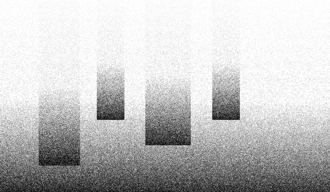
Grain textures are those subtle specks and noise patterns that give digital art a slightly gritty, film-like look. When you combine that with a gradient, it creates a dynamic blend that feels organic, real, and alive.
So why add texture to a gradient?
Because our eyes crave imperfection. Flat gradients can look too smooth, too sterile. Adding a grain overlay introduces a bit of chaos controlled chaos that makes visuals pop.
The Psychology Behind It
Here’s something cool: our brains are wired to respond to texture. It gives our eyes something to explore. Think of textured gradients as the design equivalent of comfort food. Familiar, layered, and rich.
Adding grain can:
Create a sense of warmth and nostalgia
Add visual interest without being overwhelming
Mimic analog styles (like old photos or vintage film)
Why Designers Love It
There’s a reason grainy gradients are trending hard in branding, social media, and UI design. Here’s what makes them so appealing:
A. They Feel More “Human”
Digital design can sometimes feel… well, digital. Grain brings that analog touch that reminds people of tangible materials.
B. They Add Depth Without 3D
You don’t always need shadows or layers to add depth. Texture alone can give a design dimensionality.
C. They’re Versatile
Grain can be subtle and soft or bold and gritty. Whether you’re working on a minimal app interface or an artsy poster, it adapts.
D. They Play Nice With Typography
Text on a plain gradient might get lost. But with texture, it becomes easier to create contrast and focus.
Where You’ve Seen Textured Gradients (Without Realizing It)
Chances are, you’ve already interacted with textured gradients, even if you didn’t know what they were. They’ve become a staple in modern digital aesthetics.
A. Spotify Wrapped
Remember those stunning visuals at the end of the year? Yup, textured gradients all over the place.
B. Instagram Stories Filters
Some filters use subtle grain overlays on top of gradient backgrounds for a warm, dreamy look.
C. Brand Campaigns
Modern brands like Glossier, Figma, and Adobe use textured gradients in everything from ads to landing pages.
D. Movie Posters
Especially indie films or throwback themes grain adds that vintage cinematic flair.
How to Create a Textured Gradient
Making one isn’t rocket science. You just need the right tools and a creative eye. Here’s a step by step breakdown for getting started.
Tools You Can Use
A. Adobe Photoshop
The classic. Layer your gradient, then add a grain texture layer. Blend it with modes like “Overlay” or “Soft Light.”
B. Figma
Not just for UI! You can use plugins like “Noise & Texture” to overlay grain on gradients.
C. Procreate
Ideal for digital illustration. There are brushes specifically made for texture and grain effects.
D. Canva
Beginner-friendly. Use pre-made textures over gradient backgrounds for an instant upgrade.
Step-by-Step Process (Photoshop Example)
A. Create your gradient layer using the Gradient Tool.
B. Add a new layer above it. Fill with 50% gray.
C. Go to Filter > Noise > Add Noise. Choose Gaussian and check Monochromatic.
D. Set this layer to Overlay or Soft Light.
E. Adjust opacity until you get the look you want. Done!
You can also experiment with blur filters, masking, and blending styles to make it uniquely yours.
Tips for Using Textured Grains Effectively
Like any good design trend, it can be overdone. Here’s how to keep it balanced and stylish:
A. Keep It Subtle (Unless You Mean to Go Bold)
Grain isn’t always meant to scream for attention. A light dusting can go a long way.
B. Test Contrast With Text
Make sure your grainy gradient doesn’t overpower your text or icons.
C. Stay on Brand
If you’re designing for a clean corporate site, a noisy texture might feel out of place. Match the tone of your visuals.
D. Pair With the Right Fonts
Grainy textures give off a retro or organic vibe. Think serif fonts, hand-written styles, or rounded sans serifs.
E. Don’t Forget Accessibility
Texture can reduce legibility if overused. Make sure color contrast still meets accessibility standards.
Advanced Uses: Taking It a Step Further
Once you’ve mastered the basics, try mixing in other elements:
A. Layer Multiple Grains
Stack different grain intensities for a complex look.
B. Use Grain Masks
Apply grain only to certain parts of the gradient for visual focus.
C. Blend With Shapes and Illustrations
Use textured gradients as backgrounds behind vector art or icons for a polished look.
D. Animate Them
A slow-moving gradient with animated noise creates a magical effect in web design or digital ads.
The Future of Textured Gradients
As technology evolves and audiences crave more organic, “real” digital experiences, textured gradients aren’t going away anytime soon. With the rise of generative art, AI design, and experimental branding, expect to see even more creative applications of this style.
Whether you’re creating for web, mobile, print, or motion textured grains add a layer of sophistication and artistry to otherwise simple gradients.
Textured grains are more than just a trend they’re a design upgrade that brings warmth, depth, and personality to your work. If you’re looking to spice up your next project, this might be just the tool you need.
From subtle overlays to dramatic effects, textured gradients open a world of possibilities. So the next time you’re staring at a flat gradient wondering what’s missing try throwing in some grain.
Who knows? That tiny bit of noise might just make the biggest impact.