Typography trends come and go, but some styles are just too iconic to fade away forever. One of those timeless design gems? Retro typography. Yup, the bold, groovy, and nostalgia-filled fonts from the past are officially making a major comeback. Whether you’re scrolling through social media, browsing product packaging, or exploring website headers, retro fonts are popping up everywhere and people are loving it.
But what exactly is retro typography, why is it trending again, and how can designers make the most of it without making things feel outdated? Let’s dive into the world of retro type and explore how this blast from the past is shaking up the design world in a very modern way.
What is Retro Typography, Anyway?
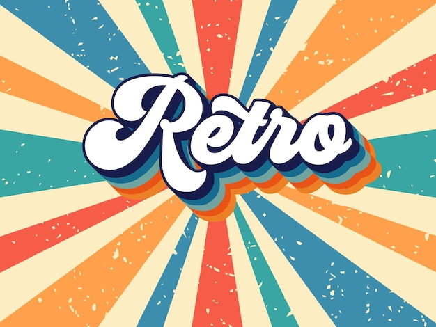
Retro typography refers to typefaces and lettering styles inspired by design trends from the past. Typically, the “retro” period covers the 1950s through the 1990s, though sometimes it dips into earlier decades.
Some key features of retro fonts include:
A. Playful curves and swashes – Think funky loops, exaggerated serifs, and whimsical lines.
B. Bold and vibrant colors – Retro fonts often pair with bright color palettes that scream “look at me!”
C. Nostalgic references – You’ll find styles reminiscent of diner signage, vintage TV shows, old-school comics, and neon signs.
D. Textured or grainy finishes – Many retro designs mimic old printing methods like letterpress or screen printing, giving them a worn or tactile feel.
Retro typography is less about strict rules and more about evoking a vibe. And right now, that vibe is catching fire.
Why Retro Typography is Trending Again
You might be wondering why now? Why are so many brands and designers suddenly falling in love with fonts from decades ago? There are actually a few reasons behind the revival:
A. Nostalgia is Powerful
In uncertain times, people crave comfort. Retro typography reminds us of “simpler times,” childhood memories, and cultural icons we grew up with. Fonts inspired by the ’70s, ’80s, or ’90s immediately create an emotional connection.
B. Visual Standout Factor
Let’s face it: modern minimalist fonts have started to look a little… the same. Retro fonts offer designers a way to break the mold and inject personality back into their work. Big, bold, and quirky retro typefaces are hard to ignore.
C. Vintage is Cool Again
From vinyl records to vintage clothing, retro style has made a full on comeback in mainstream culture. Typography is just catching up to the trend that’s already happening in music, fashion, and home decor.
D. Social Media Friendly
Designs using retro typography are super shareable. The nostalgic feel mixed with eye catching visuals makes them perfect for Instagram posts, TikTok graphics, and YouTube thumbnails.
Popular Retro Typography Styles
Not all retro typefaces are created equal. Depending on the era you want to channel, there are different aesthetic vibes to explore:
A. 1950s – Classic Diner & Atomic Age
This era’s typography features bubbly sans-serifs, hand-lettered scripts, and atomic starbursts. It’s playful and optimistic—perfect for brands that want a cheerful, retro Americana look.
B. 1960s – Psychedelic & Groovy
Fonts from the ’60s are full of swirls, exaggerated curves, and experimental layouts. Think flower power, peace signs, and Woodstock vibes. Great for artistic or free-spirited designs.
C. 1970s – Funky & Bold
The ’70s brought bold slab serifs, condensed fonts, and funky scripts into the spotlight. They’re often paired with earthy tones like orange, brown, and mustard yellow. Perfect for a vintage-meets-modern aesthetic.
D. 1980s – Neon & Techno
Fonts from this era lean into neon lights, chrome effects, and futuristic vibes. Think arcade games, synthwave music, and Miami Vice. These are perfect for tech, gaming, and nightlife branding.
E. 1990s – Grunge & Pop Culture
From graffiti-inspired fonts to pixelated type, the ’90s had it all. This decade offers a mix of underground rebellion and bubblegum pop. Great for edgy brands or Gen Z-focused content.
How to Use Retro Typography Without Overdoing It
Retro typography can make your designs stand out but there’s a fine line between vintage charm and outdated eyesore. Here’s how to strike the right balance:
A. Mix Old with New
Combine retro fonts with modern layouts or minimalistic elements. This contrast keeps your design fresh and current while still tapping into nostalgic vibes.
B. Use Retro Fonts Strategically
Don’t type out your entire paragraph in a psychedelic font. Use retro typography for headlines, logos, or callouts. Let it grab attention, but don’t overwhelm the reader.
C. Pair with the Right Colors
Vintage doesn’t have to mean faded. Use bold, era-specific color palettes to emphasize the retro feel—or tone it down with muted tones for a more subtle look.
D. Mind the Message
Make sure the font fits your message. A 1970s disco-style font might be great for a music festival poster, but probably not the best choice for a law firm.
E. Don’t Forget Readability
It might look cool, but can people actually read it? Always check legibility, especially on mobile devices and smaller screens.
Where to Find Retro Fonts
Looking to give retro typography a spin? There are tons of great font resources online where you can find both free and premium options.
A. Google Fonts
Great for web safe, accessible fonts with a few retro-inspired choices.
B. DaFont & FontSpace
Popular sites for free, community uploaded fonts. Always check licensing for commercial use.
C. Creative Market
A fantastic marketplace for premium retro fonts designed by indie creators.
D. Envato Elements
Subscription-based service with a vast library of retro and vintage font packs.
E. Adobe Fonts
If you’re already using Adobe Creative Cloud, take advantage of their integrated font library.
Examples of Brands Using Retro Typography Right
Still unsure how retro typography works in the real world? Check out how these brands have used it creatively and effectively:
A. Burger King
Their 2021 rebrand used a custom retro inspired font that immediately gave off a ’70s fast-food vibe. It feels warm, familiar, and totally intentional.
B. Spotify’s Throwback Playlists
Spotify often uses retro fonts to promote their “throwback” playlists. The fonts instantly set the tone and tap into listeners’ nostalgia.
C. Stranger Things (Netflix)
The show’s iconic title font channels Stephen King novels and ’80s horror flicks. The result? A perfect mix of suspense and retro cool.
Trends in design are always evolving, but retro typography proves that some styles are just too good to be left behind. Whether you want to create a fun, nostalgic vibe or stand out from the sea of clean sans-serifs, retro fonts offer a powerful way to connect visually and emotionally.
Just remember: the key is balance. Use retro typography to enhance your design, not overwhelm it. Mix in modern elements, pay attention to context, and always keep readability top of mind.
In the end, retro typography isn’t just a trend it’s a tool. And when used right, it can bring depth, personality, and a little bit of joy to your creative work.